The most popular post on Content Desk this year showcased an innovative way of presenting tired information. This CV from Yahoo CEO Marissa Mayer can teach content marketers a valuable lesson on how to engage an audience
This post was originally published on 7 September.
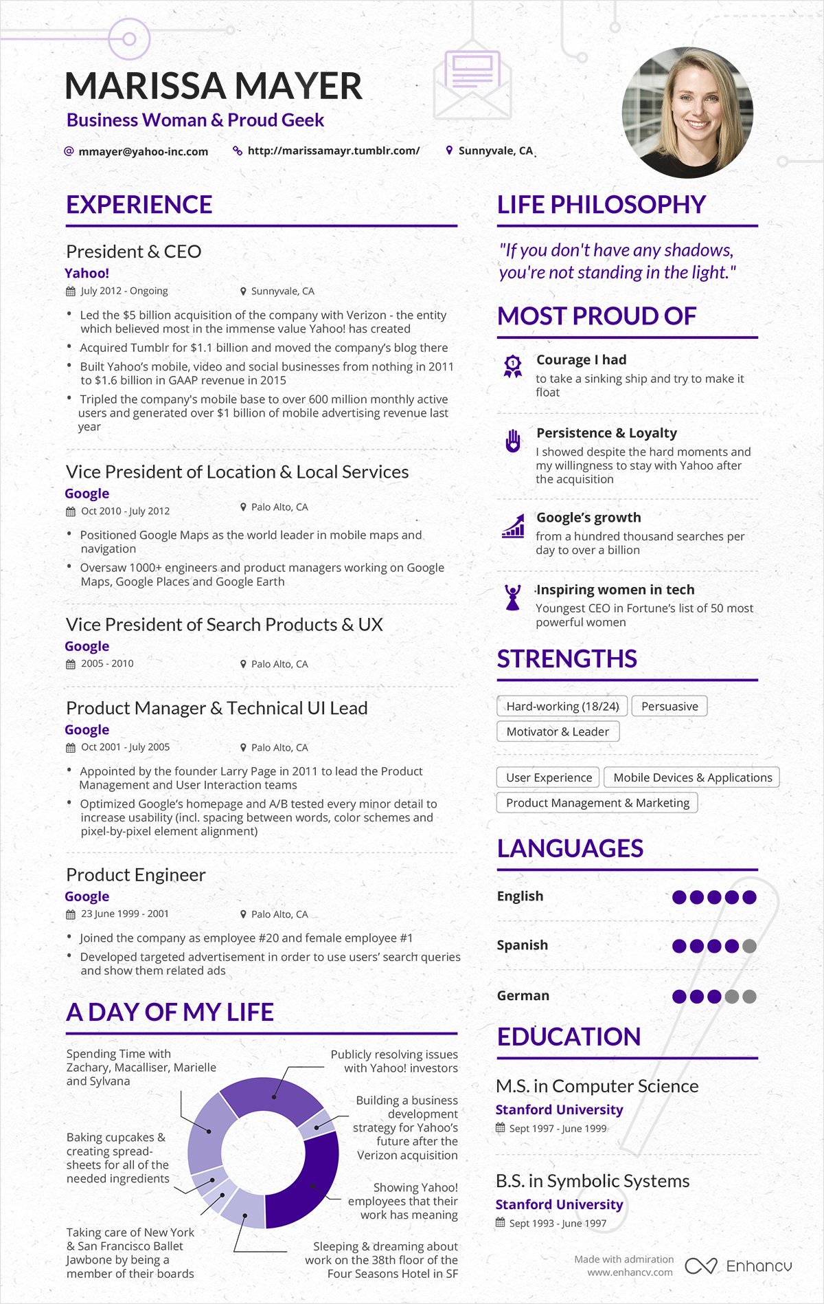
Marissa Mayer is a business woman and proud geek. At least, that’s what it says on the CV that has recently been much admired on LinkedIn and elsewhere.
She is also the chief executive officer of Yahoo and has an impressive CV. Mayer was employee number 20 at Google, back in June 1999, and was the first female to join the business. She rose through Google’s ranks to be vice president of search and UX before masterminding the growth of Google Maps.
Things may not have worked out so well at Yahoo (and this is unlikely to be Mayer’s genuine CV*) but it’s an interesting case study.
There’s plenty more that can be learned about Mayer by a quick glance at her CV. The reader gets a real idea of her personality, as well as her values, education and skills. Take a look for yourself, it only takes a moment to scan the one-pager – and that is where this CV becomes truly interesting for content marketers.
Structured information
The traditional CV is carefully structured with sections to reflect the attributes and experiences the writer wishes to highlight. We all know that long paragraphs have no place on a modern CV. But Mayer’s resumé takes thing a step further. No block of text is more than a sentence long. More than half the text is accompanied by some sort of self-explanatory icon, and about a quarter of the information is shown graphically, using pie-charts or a scale.
The eye can roam quickly, absorbing information. The graphic elements draw the reader’s attention, increasing engagement.
Beyond the layout and design
There is something more to this CV. The structure and design are effective – but the impact is increased by the choice of content. The fact that Mayer opts to use a pie chart to show a day in her life, rather than some impressive financial data, says a lot about her.
The same goes for the choice of quotation and selected strengths.
The lesson for the content marketer is clear: the design must be engaging but the content must be compelling too.
Much of the material that content marketers produce is text-based. Infographics are acknowledged as a great way to convey information, but we should be aware that there are plenty of other ways to get the message across.
Design, text, graphic elements and structure can all be varied to ensure the information we are sharing is as accessible as possible.
An 800-word article, with or without an infographic or image, may not be the best way to proceed and should not become a default. The audience, information and intent must be considered every time we commission or create content.
And, just as with Mayer’s CV, we must ensure the content is as strong and considered as its presentation.
*The CV was created with an online tool, Enhancv. Mayer may have had nothing to do with its creation. Whatever the case, it still stands as an effective example of engaging content.

