Striking cover imagery can elevate your print content to great heights. Here are some you can learn from
The American Society of Magazine Editors (ASME) includes editorial leads of most consumer and business magazines in the United States.
So when they announce who has won their Cover of the Year prize, it’s worth paying attention.
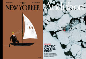
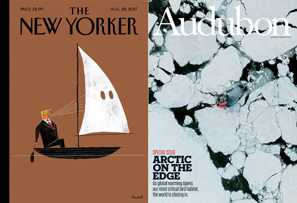
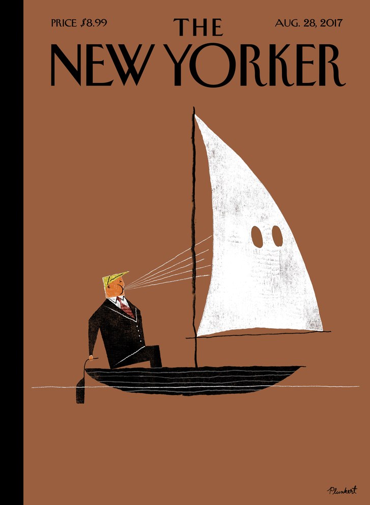
The prize for 2017 went to The New Yorker’s August edition, entitled ‘Blowhard’.
It’s a great example of what can be achieved from a magazine cover – a design that is beautifully pulled off, thought provoking and multi-layered.
Here are five covers with lessons to learn for your own content.
The New Yorker, August 2017
This award-winner from David Plunkert continues The New Yorker’s tradition of striking, illustrated covers.
The magazine has built a brand off it. It’s instantly recognisable and a design classic. For content marketers, there’s plenty to learn – and plenty to be jealous about too.
The New Yorker has almost 100 years under its belt plus a global reputation for high-quality writing and satirical cartoons. That means it can afford – no, it is obliged – to take some design risks. And of course its fame means high budgets. That may well not be the case for your own brand.
But as always, it simply comes down to audience.
The New Yorker knows its audience expects politically-charged content and so delivers it very effectively. Meanwhile, the option of an illustrated cover is open to anyone. And it’s worth considering. It offers up an engaging alternative to photographic covers and can add a playful, artistic touch to your output.
Audubon, January-February 2016
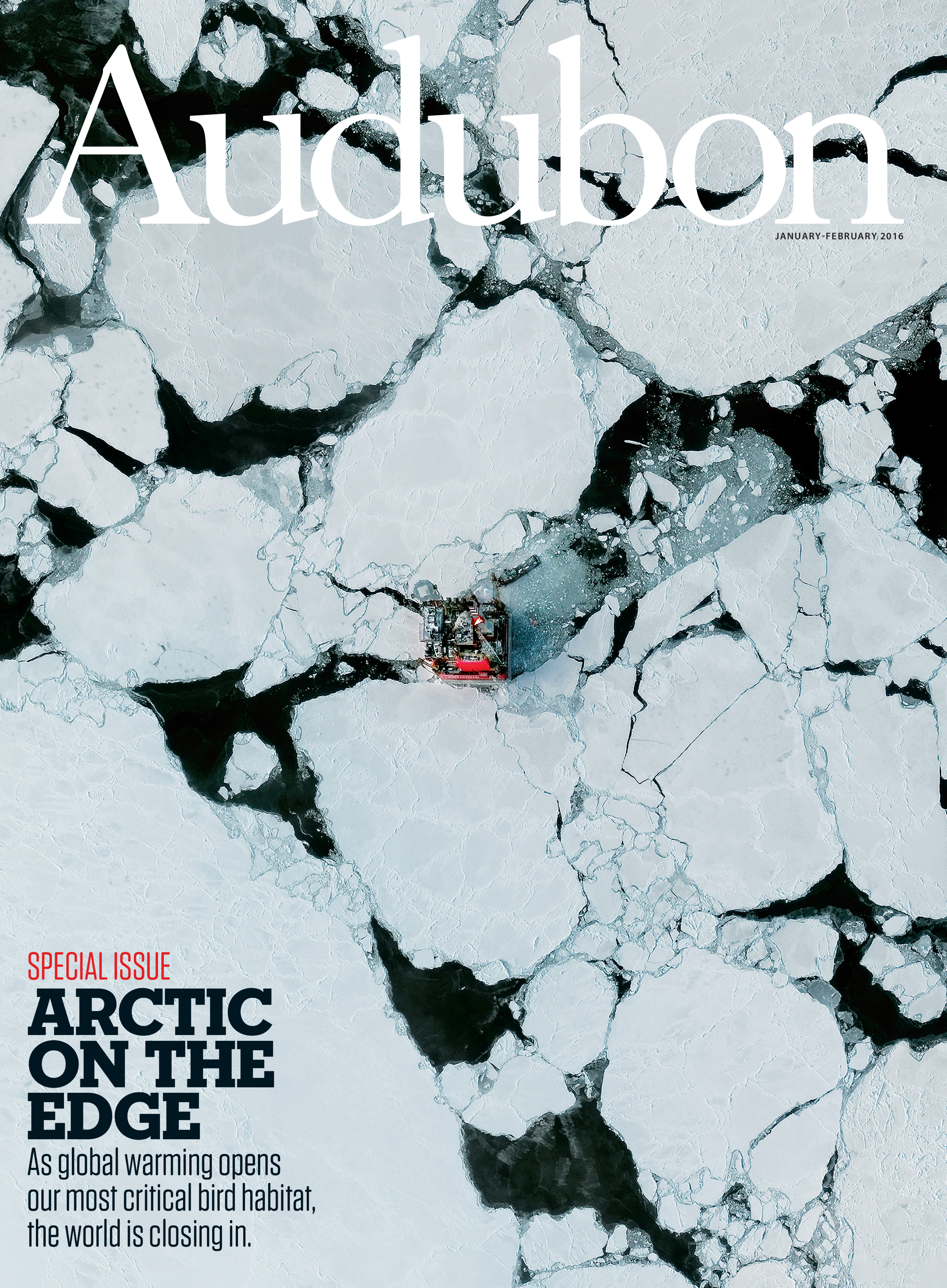
This bi-monthly magazine centres on environmental and conservation issues.
For this issue (photographed by Benjamin Grant) they looked for a little-seen angle – a bird’s-eye view of drilling on an oil platform off Western Siberia.
It’s the literal representation of that old journalistic adage, ‘find a fresh angle’. In this case, the angle had to be manufactured as Grant painstakingly stitched together multiple satellite images to make the finished product.
That kind of legwork isn’t always practical, of course, or indeed required. An effective cover image might just need some lateral thinking. If you’re looking to depict social media, for example, try moving away from screenshots of phones and instead focus on the idea of followers. (This blog gives you some pointers.)
WIRED, April 2016
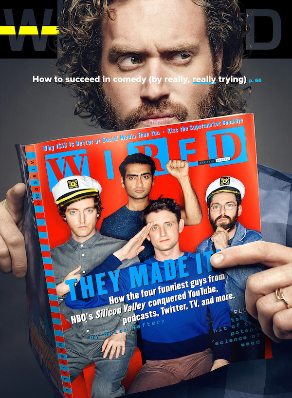
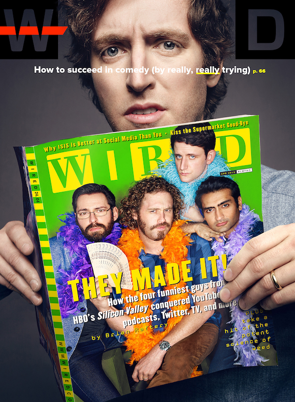
Regardless of audience – be that B2B, B2C, clients, member-only publications or others – sometimes a glimpse behind the curtain can make for an enticing cover.
Photographer Art Streiber took these photos of the cast of hit HBO show Silicon Valley for WIRED magazine. The five covers show each of the five principal cast members holding the magazine. The catch being that they don’t feature on the one they’re holding – hence the miffed expressions.
It’s a meta look at the process behind choosing a cover, with the ironic spin you’d expect from WIRED and a comedy TV series.
‘Going meta’ is probably a one-time trick. But adding a slice of the backstage can be a really effective touch.
That might mean just pulling the frame back on the photo so that the cables and lights are in shot. Or an informal shot of your subject being spruced up with a dash of foundation might convey exactly the kind of human touch you are looking for.
New Scientist, October-November 2016

Each week, New Scientist unpicks and explores the universe through the latest developments in science and technology.
It’s there to make you think and see the world differently.
As such, this cover is a great example of taking an everyday object and adding a new spin – all housed within a beautiful sea-blue.
The design is complemented by an intriguing tag line that could act as a description of the whole brand.
The cover is a lesson both in letting creative imaginations run free and design minimalism. With that, you can encompass the largest of topics with the simplest of objects.
ICAEW, February 2018
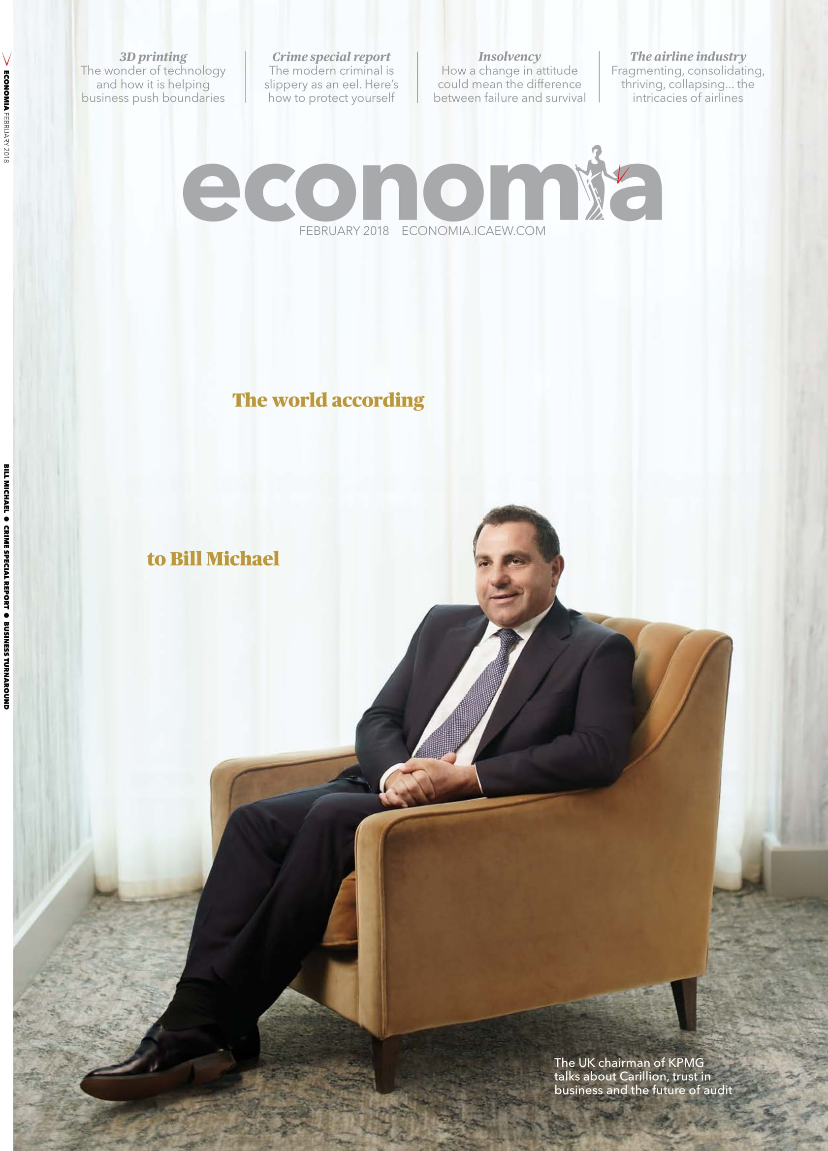
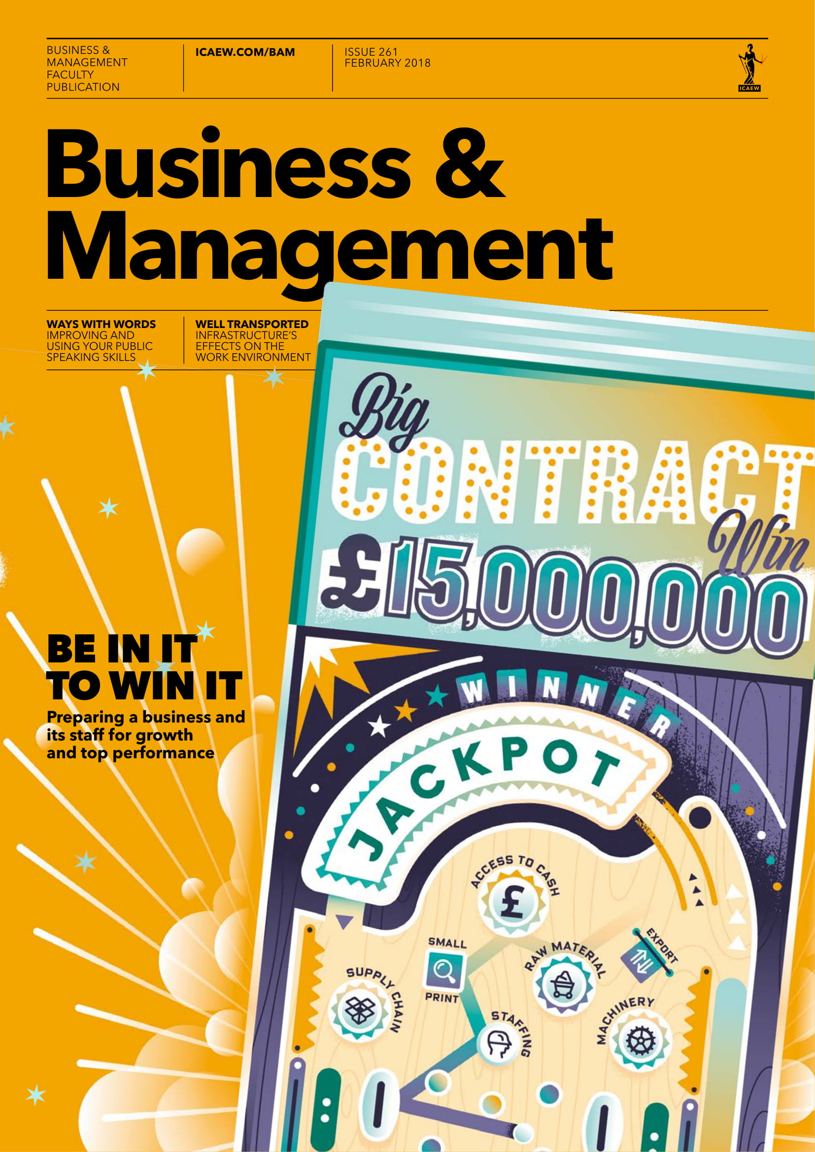
It’s cheating, but here are two that showcase how design is always dictated by audience.
In this case, the client is the same – the ICAEW – but the readership is very different.
Full disclosure, these magazines are produced here at Progressive Content, part of our multichannel portfolio across a variety of sectors and clients.
Ewan Buck, design director at Progressive Content, explains further: “economia has a very confident, smart approach that treats its wide reader base as the informed business professionals we know it reaches. Sometimes there is no need to shout.
“Business & Management, on the other hand, is aimed at a much smaller, targeted audience. We know the competitive set can be a bit dull so we tend to dial up the colour while still getting over a lot of detail.”
It’s a good lesson in what should be obvious, but might not be. Keep the end reader in mind at every stage. What job do they have? Where do they live? Look around at what other publications in your sector are doing – and pick holes in them. Whether graphic, photographic or illustrated, your magazine cover is a window into your brand.
That might mean sticking doggedly to one style and tweaking to reflect current events (à la The New Yorker) or it may mean a slice of simplicity (see economia).
But keep in mind: whatever cover you go for, it will be judged.