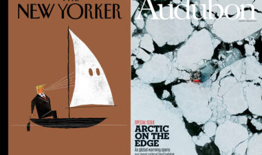
Art editor Sarah Barnett shares her favourite magazines.
Everything about this magazine inspires me. Made by the guys at Fabrica, the agency created by Benetton in 1994, Colors boasts a massive editorial team from all over the world, thus enabling the content to be truly global. It’s had a checkered past and is either loved or hated depending on which transmutation of the originally conceived idea you view, but the message is always the same ‘diversity is good’.
The recent series of Colors focuses on one subject… this quarter it’s football and last time, moving house. Colors even did a ‘SHIT’ issue.
The design is clean and simple; the copy sits perfectly with the awesome portraiture. Nothing is overdone or unclear. It challenges you in all the right ways… that means the subject, not the design.
I can’t read or speak Italian but I still pore through the pages of IL Magazine for hours in admiration. Each page is a piece of artwork… giving the reader a multitude of journeys through graphics, imagery and bonkers layout. It’s rigid yet totally free and uses infographics correctly: here they slap you across the face with confidence and intelligence – no half-measures or shoe-horning to try and enhance bad content.
IL bosts great illustration as well… these are used in clever ways and IL features great little icons that are funny and quirky. This is pretty hard to get right and can skew the whole identity of your mag if done incorrectly. This all hints at a great relationship between editorial and design. If only I knew what the hell it said!!
Few magazines are as iconic as this and few have enjoyed an art director in the form of Arem Duplessis. It’s fair to say that Duplessis has influenced every art director in one way or another, and at one stage every major magazine seemed to look like his work. How Duplessis’ departure to Apple will impact the New York Times Magazine remains to be seen. He should be celebrated for epic covers and inspirational photography. Duplessis is always brave and constantly proves the power of typography and how breaking all the rules is a must for any self-respecting designer. Nobody breaks the rules and instantly make new ones quite like Duplessis.
Working in business design is often frustrating for a creative, but Richard Turley’s time at Bloomberg Businessweek proved that brilliant editorial can be spurred on by controversial design and illustration. Why not take a simple portrait and slap a shocking graphic on it? Turley’s style probably stems from designers having to be everything now… on top of working on layouts they are often graphic artists, typographers, illustrators and photoshop wizards.
But the main thrust of Turleys Bloomberg work was pace. Working to a weekly schedule he had limited time to do the cover (with a massive team mind) so pretty cut outs and tidy, tight, subtle graphics were not possible. Like Arem Duplessis, Turley has left the title that made his name, yet his influence will doubtless remain strong.
Mercy Magazine
The above might be obvious choices, so my last choice is much less so.
Mercy is a ‘zine’ from my student days in Liverpool, and was set up by my mates Joe and Doug. They wrote and illustrated it, and photocopied it on the uni printer. It was pretty crude but had a place. It mainly mocked Liverpool’s then title as capital of culture through poetry and illustration. When liverpool won the title, the money rolled in – unfortunately it went to gentrification and not cultural revolution. So Mercy magazine made sure the real culture wasn’t totally washed away. As it evolved and matured, it picked up press from the likes of Dazed & Confused, The Face, the Guardian, BBC Radio 1 and 4 and won influential backing from the legendary broadcaster Tony Wilson.
In my view self-publishing lies at the heart of print. Afterall, the printing press was invented to mass produce words. The fact that anyone can do it with just a bit of cash and a shed-load of work is pretty amazing. From ‘The Wipers Times’ (a World War 1 paper made by the 12th Battalion Sherwood Foresters who stumbled across an abandoned printing press in Belgium and used it to lampoon the military situation of the day) to the little graffiti gang magazine my friends and I made when we were kids… print has a massive impact on everyone. It’s a real opportunity to voice opinions and news.
Sarah Barnett is art editor at Progressive Customer Publishing
Visit Content Cloud to sign up as a creator, or commission the content your business needs


