After the unveiling of The Guardian’s new design, we look at why brands should always question if a creative refresh is necessary – and some of the consequences if it isn’t
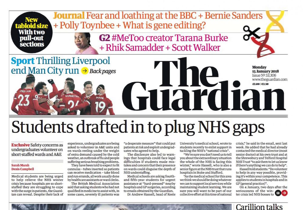
Kicking off 2018 with a creative bang, The Guardian ushered in a brand overhaul, heralding papers that were “smaller in form” (from Berliner to tabloid size), but “more modern, bold and accessible than ever.”
Gone was the familiar deep blue-and-white masthead, replaced with a striking monochrome header and new typeface. Editor-in-chief Katharine Viner called the revival “visual and serious; explanatory and keepable; full of life and stories and ideas.”
Videos publicising the change underlined the brand’s new philosophy of making space – both literally, with the renewed format, and intellectually for “big ideas.”
So do the changes position The Guardian as a revitalised thought leader? Or will the rebrand soon fade away as quickly as old news?
Reviews are mixed.
Some announced a strong, confident and elegant design. Others judged it had been drained of colour, become inconsistent and even emulated the style of its competitor, the Evening Standard.
Is it the right solution?
Rebranding covers a breadth of strategic and creative changes – from updating visual assets, to restyling editorial messaging, to a complete strategy overhaul. As such businesses need to seriously consider the scale of a rebrand.
A project’s scope can easily creep up and the prospect of reinvention can make brands creatively and financially overzealous.
A good design agency should curb trigger-happy impulses by inspiring brands to interrogate who they are and who they want to be after their rebrand. They should encourage businesses to ask what questions they’re trying to solve – and if a rebrand is in fact the right solution.
Cost is also a huge factor. Companies regularly spend 5-10% of their annual marketing budget on rebranding. Larger digital transformations can cost in excess of £50,000 depending on business size.
The good and the not so good
Rebranding can revive an outdated, even dying brand. But what happens when rebranding goes wrong? We take a look at two brands that got it right… and two that really didn’t.
1. Lego
Nearing bankruptcy in 2004, Danish toy company Lego became a case study in turnaround success. From 2004 to 2017, CEO and former consultant Jorgen Vig Knudstorp helped rebrand the company to highlight that building bricks were merely the starting blocks.
Computer games, films, even theme parks, strengthened the group’s portfolio and created more access points for consumers. Children, teens and adults could now effortlessly enter their playful world without touching a brick. By ensuring it diversified its products and reasserted a strong brand identity it told customers that Lego was far more than a toy – and had well and truly burst into the digital world.
With his background in technology, current CEO Niels B. Christiansen is aiming to continue Lego’s upward trajectory by staying ahead of the digital curve.
2. Burberry
The early 2000s was thought to be the death-knell for the luxury fashion brand. The label’s distinctive check print had become inextricably associated with what became known as ‘chav culture’. It was far from the brand’s high-fashion target audience.
Yet with the appointment of chief executive Angela Ahrendts in 2006, the brand acknowledged and addressed its image problem. For Ahrendts, the key was influencers. Well-chosen public faces to represent the brand and garner positive publicity. The likes of Eddie Redmayne, Emma Watson and Romeo Beckham were brought in and dramatically shifted customer perceptions, ultimately enhancing the brand’s value.
3. BBC Three
Although remaining anchored by its BBC status and bold pink-and-black colour palette, 2016 saw the birth of BBC Three’s unusual ‘tri-con’ and new visual identity – driven by its reinvention as a digital-only service.
On release, audiences, and even BBC Three’s own head of marketing, mocked the similarities to BBC spoof show W1A, particularly focusing on the fact that the logo omitted the actual number three. Others commented that the new identity echoed the remote control pause symbol – presumably something a video-centric channel would prefer to avoid…
4. Tropicana
2009 was the year of the mighty Tropicana rebrand fail. The PepsiCo-owned brand decided to reinvigorate its range of juices, repackaging the drinks and spending $35 million on ad campaigns to promote the new look.
The brand erased the iconic ‘orange with straw’ imagery, cooled down the colour palette and inverted the logo.
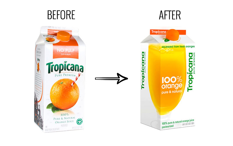
Unfortunately the rebrand was entirely unsuccessful and immensely costly. Consumers took to social media (of course) to voice their outrage at the generic appearance. More importantly, sales dropped by 20% within two months.
Tropicana quickly reverted to its previous branding and at least showed that they were, eventually, listening to consumer opinion.
A rebrand is a tough task. And in the age of instant, ferocious feedback via social media there’s a lot at stake.
But a new product, technology or shift in direction may well necessitate a bold branding move. As marketers, it is our job to sense when the wind is changing and be ahead of the game.
So when it is the moment for that change, take all the time you need to find the right collaborators (whether that’s design, editorial or tech) that truly understand your brand, its audience and what comes next.
[Looking to create some branded content? Find out how Progressive Content can help. Get in touch and see what we can do for your business]