Take a look at this great example of how content can drive sales and how to write good conversion communication
Content needs to work hard. It has a job to do, and that is often attracting prospects to the top of the sales funnel and helping move them towards a sale.
A recent email I received from Columbia Business School succeeded on multiple counts. Firstly, let’s look at how I was driven into that funnel.
The call of content
An email landed in my inbox from IEDP, a company that produces digests of business school research papers. They’d hooked up with Columbia to offer their mailing list access to a free webinar on authenticity and leadership. I signed up though missed the broadcast. A follow-up email shared a link so I could watch the recording.
A few days later the email below arrived. It tied my interest in the video to a Columbia course: the Advanced Management Program. The professor who presented the webinar is the faculty director of the programme. All pretty neat, eh?

In a couple of clicks, and with minimal spamming, I had been presented with a product that was likely to be of interest to me. Content had got me there, qualifying me as a lead and giving me access to more information.
If I click on a link to learn more, I expect there will be more emails, nudging me further down the funnel. Perhaps they’ll use some higher-level content to really convince me of their excellence.
So that was my journey down the funnel – but what of the email itself? What’s worth copying?
Conversion emails
Let’s start at the top.

Many marketing emails use an image as the header. It grabs attention but, for a serious B2B communication, it can feel cheap. Here we just have a logo and some simple branding. It feels like a letterhead, and letters have a gravitas that a stock image of corporate middle managers laughing does not.
The body of the email quickly moves from the content to the product. There’s no waffle and no attempt to hide the fact that I’m being sold to.
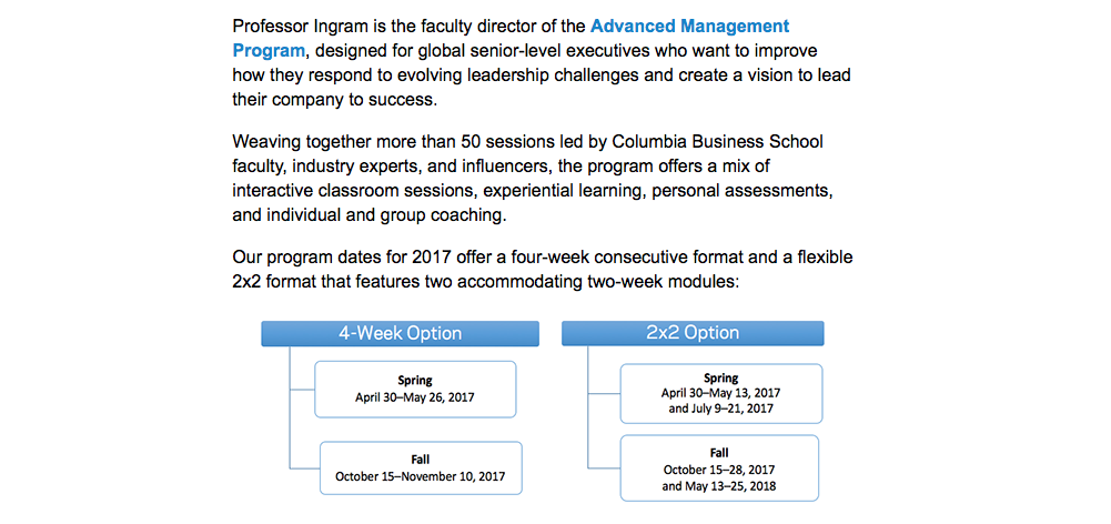
The information is clearly laid out. Visuals are used to make a complicated structure clear.
The benefits of the product/programme are explicitly stated, and bullet pointed to make them easy to digest.
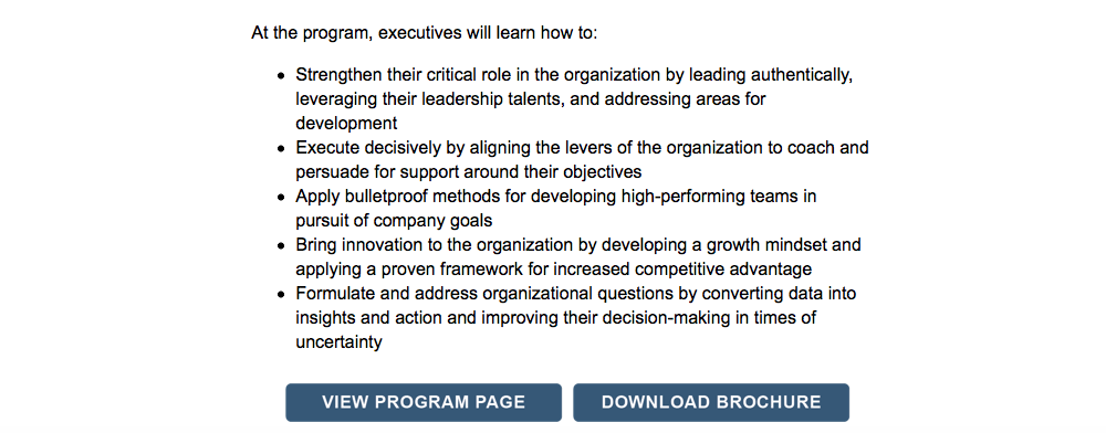
The calls to action (View Program Page/Download Brochure) jump off the page, so that if you’re skimming the email your eye won’t miss them.
The contact details of the author, Jennifer Goez, provide a further call to action.
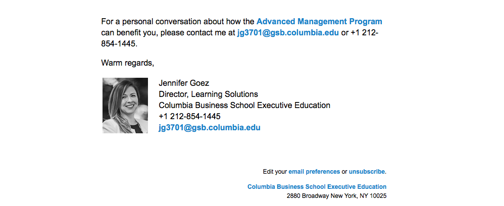
The photo of Jennifer works well too. It makes this feel like a personal invitation rather than a mass email – which is, of course, what it is.
The foot of the email is clean, with basic links and an absence of additional culture, links or logos. The feeling that this is a business letter is re-emphasised.
None of the above is shocking or new. The marketing team at Columbia are just doing the basics really well. They’re combining relevant and authoritative content with clear communication that is easy to act on. Maybe I should take a course at Columbia after all…