Some information is best communicated visually. Here’s how to do it right
Here’s a stat for you: infographics are liked and shared on social media 3X more than other any other type of content.
If you’re still reading this blog and not wishing it were more of a visual treat, then your thoughts may well have wandered to whether your brand is producing enough infographic content.
But beware, there are a lot of bad infographics out there. Here are three tips to help you avoid the common traps of ill-informed infographic execution.
Tip #1: Don’t start with the data – start with the message
You’ll have a lot of data, a much more than your audience necessarily needs.
The coolest data analyst on the block Mona Chalabi (whose excellent TED Talk we recently featured on Content Desk) says it’s more important for your audience to walk away remembering one important piece of data than not remembering lots and lots of data.
What do you want to get out of your infographic? Do you want your audience to walk away with a key fact, or a general feeling? Figure out what you’re trying to achieve and work backwards to see what’s the best piece of data to support your aim.
Chalabi keeps her infographics simple and memorable. “They don’t necessarily walk away with a specific number,” Chalabi says, “but they can remember important facts.”
https://www.instagram.com/p/BSehHqZlnts/?taken-by=monachalabi
Tip #2: Figure out how to show your data, then get creative
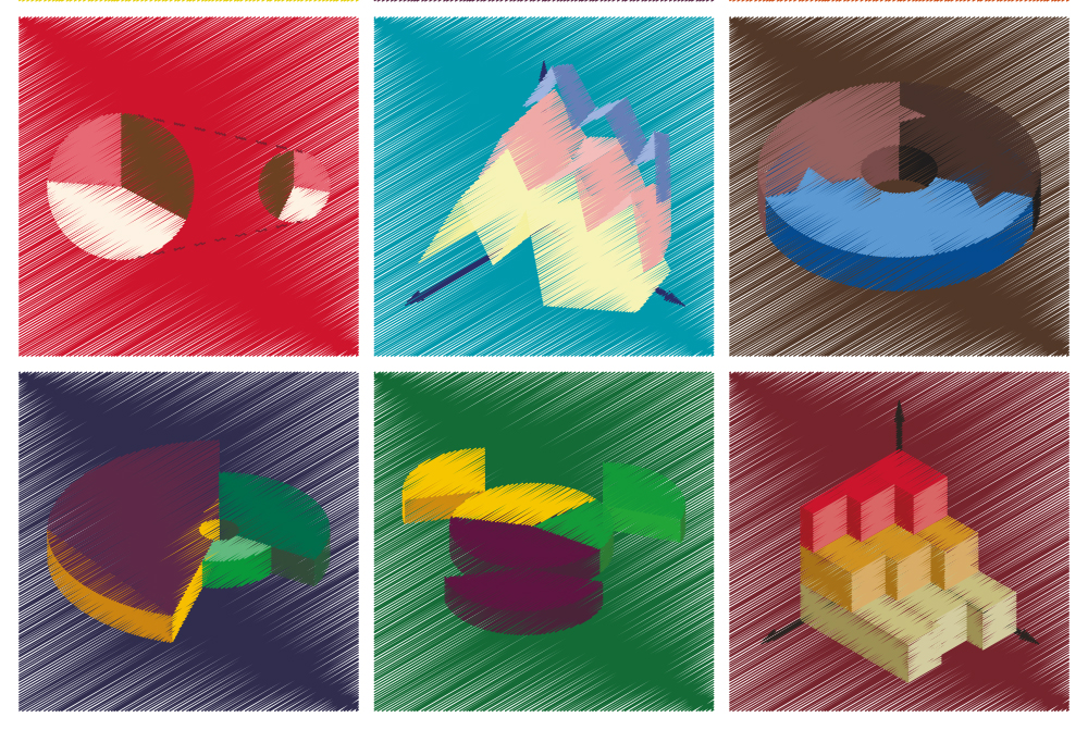
If you’re going to represent some of your data in graph form, knowing which kind of graph to use is going to save you time and your audience some confusion.
As a general rule of thumb, it’s advisable to use bar charts to show simple comparisons, bubble graphs to show big disparities in data between the lowest and highest sets, and pie charts to show how a total is divided.
Once you’ve figured out what kind of graph you need, then you can get creative. And never fear, if it’s a bar graph you need, they don’t have to be boring.
Good and Column Five created an infographic on the mapping of income by religious belief – and yes, it’s “just a bar graph”.

Tip #3: Less is more
My GCSE art teacher once told our class that she was fed up with all the white space in our sketchbooks. While that may have been salient advice for a group of 15-year-old artists who weren’t trying hard enough, the same need not necessarily apply to content marketers.
When an infographic doesn’t feel like it’s working – for whatever reason – it can be tempting to add more information to fill in the gaps in an effort to improve the situation.
This brilliant gif from Darkhorse Analytics shows exactly why that isn’t going to solve the problem.
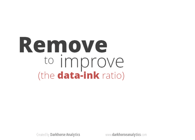
Infographics work best when they are clear, concise and striking. Research by Venngage suggested that infographics with a simple colour scheme were most popular, especially those with only two colours.
Work out what your message is, get creative, clear away the excess and watch your engagement soar.