You can pour all your hard work into creating great content, but if it looks ugly no one will read it
Content marketing comes down to making an impact on the audience. As content marketers, we are well used to poring over copy – refining, reducing and expanding as applicable.
But do we consider the aesthetic angle often enough? The words we write don’t just exist independently – they are symbols on a page or screen. To ignore the style in which they appear is to risk undermining the content itself.
And just as words and language evolve, so too does typography.
There are a few obvious clangers to be avoided (no Comic Sans, no Wingdings) but what else needs to be considered?
Typeface or font?
Or are they the same thing? Well no, not exactly. Essentially, the typeface is the group of fonts. So the typeface might be Arial or Cambria, but the font is Arial, size 12, bold etc.
The likelihood is that you don’t want to mix too many typefaces into your content. Keep it at a maximum of two to maintain some consistency – one for header/sub-headers and one for main copy. More than that and the content will struggle to appear trustworthy and professionally put together.
Personality
Your brand is represented by everything on the page or screen – and the typeface is a unique part of the picture.
What is your business looking to portray? Stoic traditionalism and stability? Or forward-thinking energy?
On the most basic level, you have a choice between serif and sans serif. Serif, with the ‘tails’ flicking off the end of the letters, has been used for decades in written copy. Sans serif, on the other hand, is often favoured for web copy. Are you looking for a more classic feel – or something more modern? (Don’t say both.)
Start from that basic choice of two, then work out.
Audience
As this blog posting shows, sometimes a choice of typeface can sum up an entire public mood.
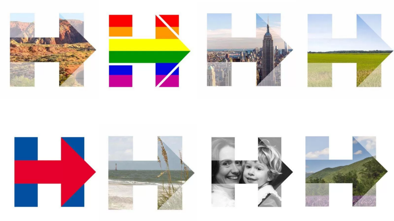
In the run up to the US presidential election, Hillary Clinton’s campaign logo was slick, professional and clear. It looked like the logo of a successful finance company, or a charitable foundation (both true, essentially).
Donald Trump’s logo, on the other hand, was more stark, garish and rootsy. There was seemingly no design expertise behind it – a simple slogan in Times New Roman on a baseball cap.
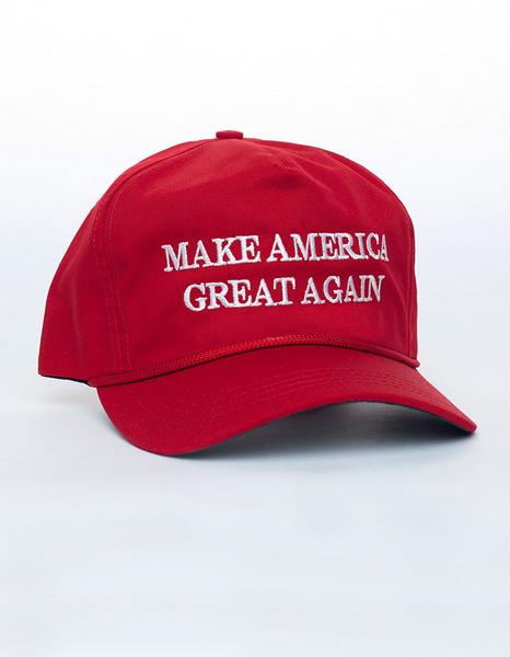
Clearly, the choice of typography reflected the values of the two candidates – but more accurately, it reflected the voters’ desired values
Everything has a history, everything comes with subtext. The same blog post looks at how the Blackletter typeface, hugely popular for centuries, is no longer seen outside of wilfully subversive designs – metal bands and tattoos, for example. The reason? Nazi leadership used it as their official typeface.
Throw out the rulebook?
Some research suggests taking an iconoclastic approach to typeface selection.
For example, there is a noticeable trend for right-wing news websites to be designed in a way that is not particularly pleasing to the eye.
The theory is that something that is harder to read sticks in the mind longer. You may get fewer people reading your content, but has your typography choice already filtered down the audience to those more likely to consume and ultimately be converted?
In reality, this is a high-risk strategy but it shows how sensitive the choice of typography can be and how things can pass under the radar. Before you make your choice you need to know the trends, be aware of the history, target your audience, understand the conventions – and decide which ones you are willing to break.
Above all, ensure your choice of typeface is part of a larger, integrated brand strategy (and make the use of Comic Sans a sackable offence).