The General Election may have caught a few people on the hoof, but there’s no excuse for the woeful standard of communications from UK political parties
We’ve already seen the poor punctuation in recent Liberal Democrat election material. That, it seems, was merely the tip of the iceberg.
From unimaginative poster designs and leaked manifestos to poorly briefed spokespeople getting their numbers muddled and the endless repetitions of alliterative slogans – it feels like we’re being played rather than engaged.
Two examples of poor content from the two big parties surfaced on social media at the end of last week – one terrible writing and the other poor design.
The Conservative Party
The writing first. The Conservatives tweeted this tortuous sentence:
For too many people in Britain today, life is simply much harder than many seem to think or realise.
— Conservatives (@Conservatives) May 18, 2017
Let’s set aside that this is poorly targeted, and that it comes seven years into Tory rule (suggesting their own record on alleviating hardship is shoddy at best). Clearly they’re trying to imply to the ‘left behinds’ and ‘just about managings’ that the Conservatives are remembering them. That while the metropolitan elite thinks everything’s rosy, they know the real truth.
But on Twitter? With that mangled and ugly sentence construction? Is that message going to hit home? No.
Try: “Many people underestimate how tough life in today’s Britain can be”. Or even: “The metropolitan elite has no idea how hard life can be for many in today’s Britain.”
Spell it out, make it simple to repeat, don’t use convoluted language – all great content lessons.
The Labour Party
How about Labour? Its communications effort is led by former Guardian journalist, Seamus Milne. So there’s some solid journalistic heft at work.
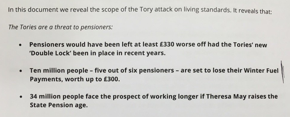
The Tory manifesto contains three measures that will make pensioners – who vote in force and tend to be conservative (small ‘c’ and big ‘C’) – much worse off. Great news for Labour: you target that in a major way, right?
Here’s Labour’s briefing note for journalists:
Looking good. There’re all compelling arguments. Then it’s backed up by this poster:
One of the more forgettable Mr Man characters. pic.twitter.com/HP7lW5ThqN
— Jim Pickard (@PickardJE) May 19, 2017
It’s a callback to a Tory poster that did well… 25 years ago. Twenty-five. And it’s just stupid. It doesn’t even deserve to be deconstructed from a design perspective, it’s that bad.
Notice something else? The three whammies for pensions are different in the poster. The briefing note says the Tories will push up the pension age (which doesn’t affect existing pensioners) and the poster highlights the care costs issue – which is the biggest de facto inheritance tax grab in British history.
What content lessons do we learn from all this?
Three things:
1. Write well. Honestly, there’s no excuse for mangled sentences and obfuscatory language.
2. Hire a decent art director. Labour’s poster looks like something sketched on an envelope that a designer would smile kindly at and then discard.
3. Make your messages consistent and well-targeted. Both Labour and Conservatives seem to be falling foul of this.
Let’s hope things improve on the political content side, or the march to 8 June is going to feel very long indeed.